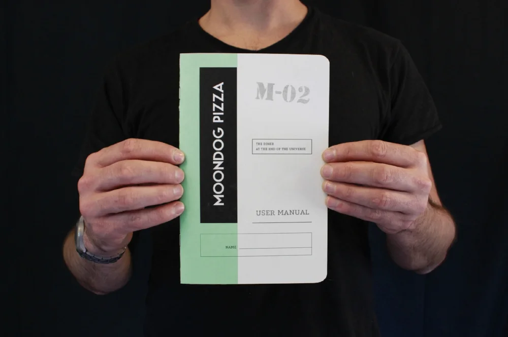
moondog pizza "user manual"
Covers: French Paper Co.'s "Construction" paper line, color: "grout grey" 130 lb cover
Text paper: 80 lb off-white linen

MISSION CONTROL | CONTROL PANELS
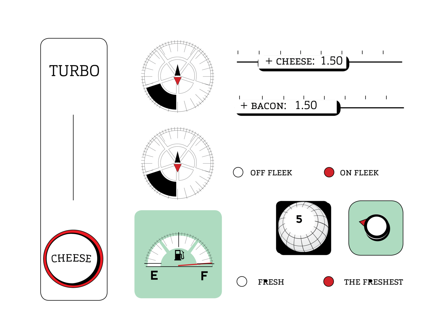
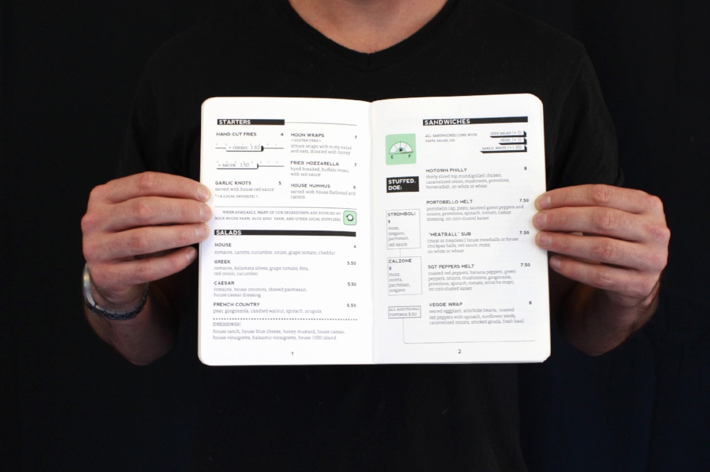
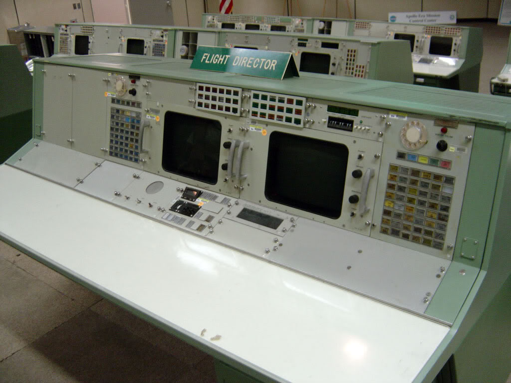
Many graphic assets are inspired by a spaceship "contol panel". I racked my brain trying to come up with a design that made the customer participate in the fun of the space theme without it being too distracting from the information. I had to start thinking like a designer, instead of an illustrator. At first, I was only trying to stylize and recreate the environment of space in general for a background on the menu. But when I asked myself, well if I was reading this menu..in space...I'd be an astronaut. -- An astronaut, in a spacesuit, in a spaceship. How do astronauts organize information? How does NASA organize information? How does a space carrier organize information?


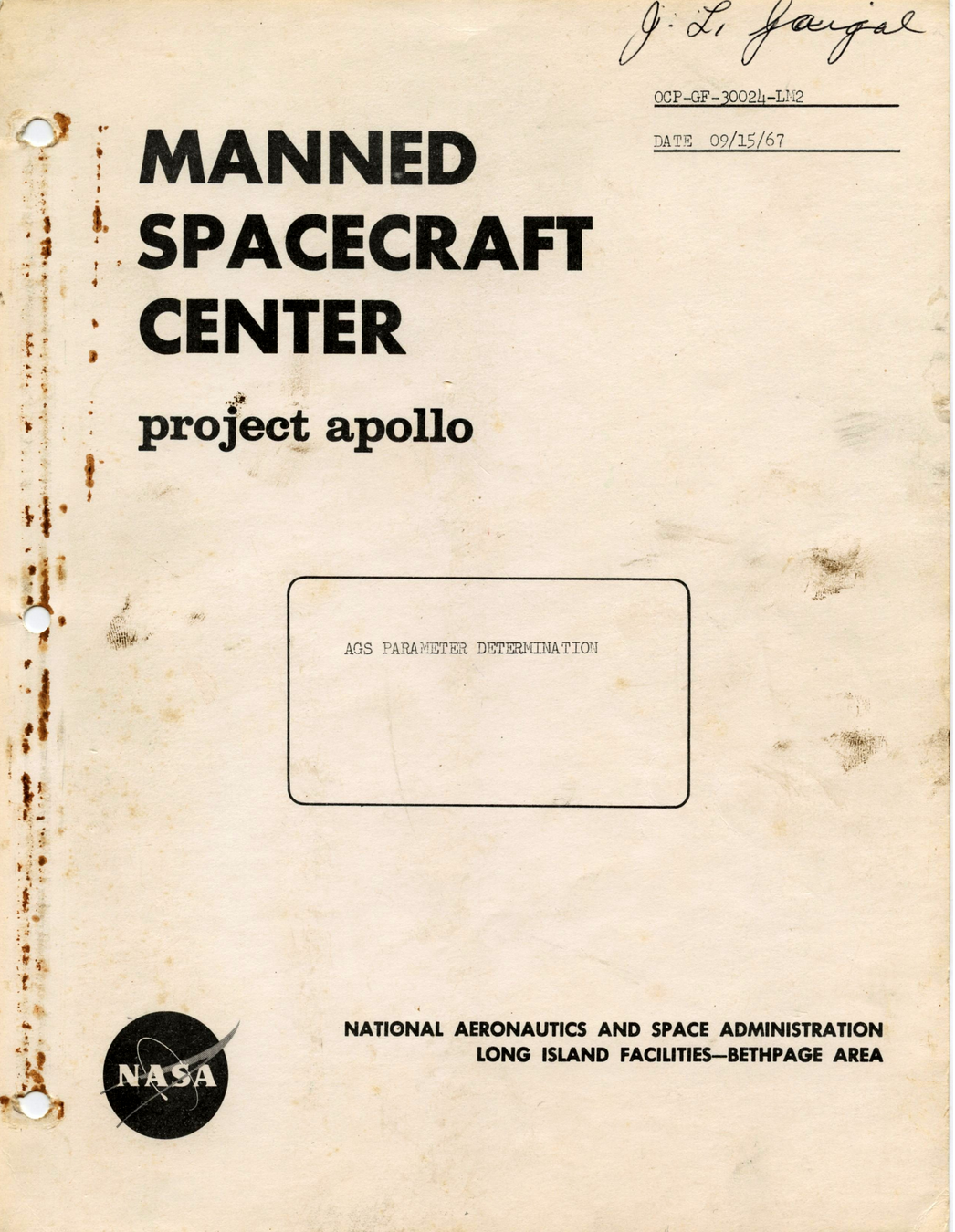
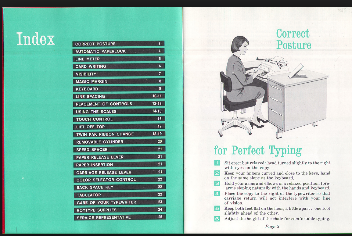
MANUAL INSPIRATION


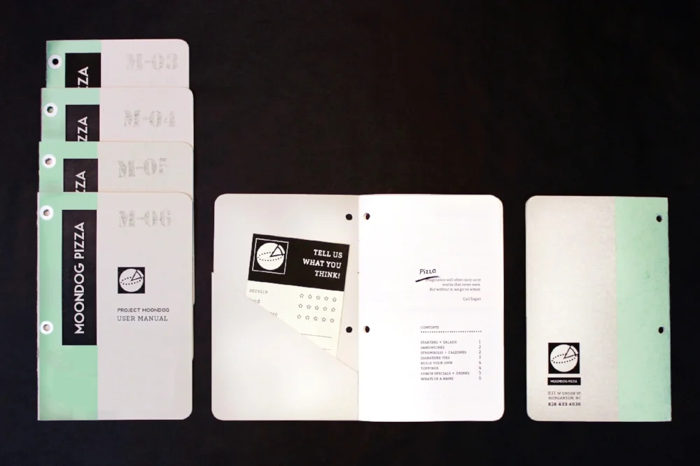
PROTOTYPE: test binding, size, paper weights
At first, I was envisioning the manuals to have more of a journal-like feel, so I tried out sew stitching the book with thread (Moondog's signature pistachio green color). But for mass production stapling made way more sense, so I ended up going with a 3 staple saddle stitch. It also worked better to push the utilitarian feel I was going for.